
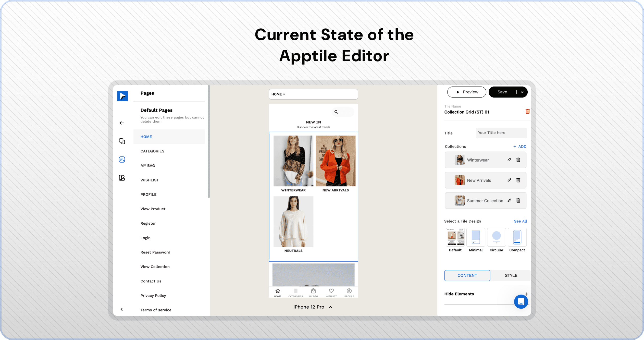
At Apptile, Shopify merchants build mobile apps without code, using stackable components called Tiles. Each Tile is customizable through a right-hand panel in the editor.
But as Tiles grew in number and complexity, the panel became cluttered and unintuitive. We undertook a full redesign to simplify this experience for both internal teams and customers.
My Role
Owned the redesign end-to-end—scoped problems, restructured the panel, and led rollout coordination across 100+ live tiles.
Team
CPO, Senior Engineer (Manas), Designer (Aritra)


Context Gathering
Business: Removed a free tier, went all paid. The model is "Pay after Publish".
There was an internal team, who would work through the customers' app in case they wanted it to be done by us or if they were facing issues. Making sure that we helped merchants unlock their mobile channel fast.
Our no-code mobile app builder used a right-side Properties Panel to customize "tiles" which are nothing but modular app sections like carousels or grids. Over time, this panel became a bottleneck for both users and internal designers.
Diving deep into Hotjar Sessions
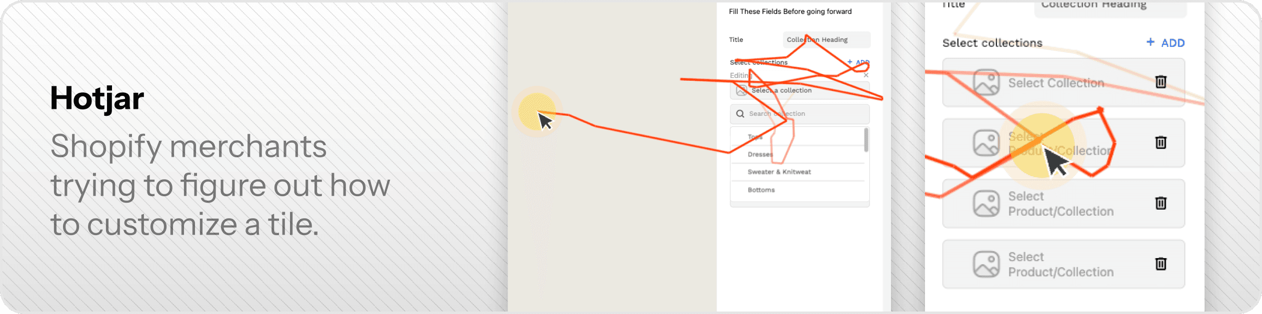
Shopify Merchants
They couldn’t predict where a control would appear. Sometimes essential settings were buried. Other times, fields needed at the start of customization were absent until too late.
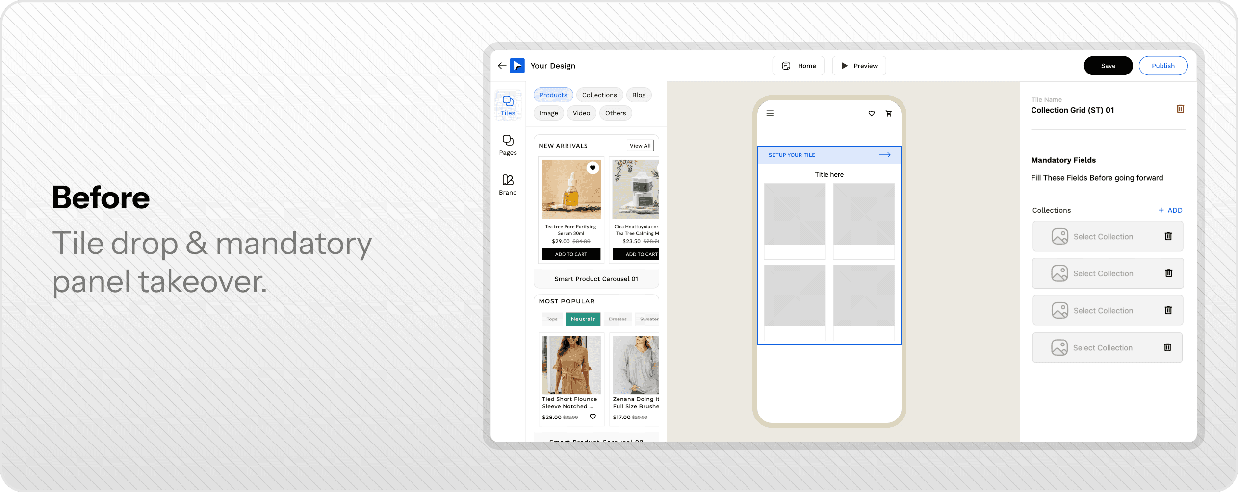
They would not understand why their customization controls go away. On mandatory panel Hijack.
Internal Team
Even our own designers were switching tools mid-flow just to find styling controls in predictable locations.
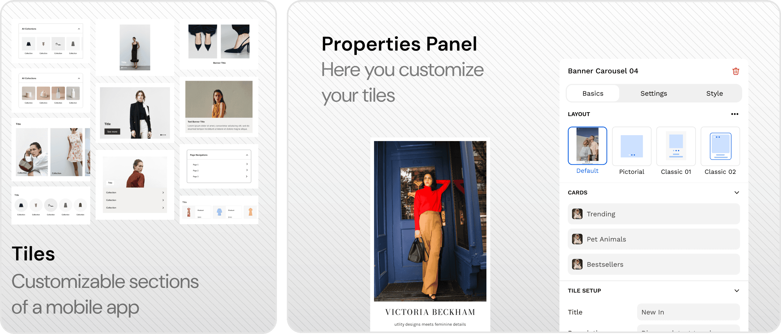
Current Behavior & Anatomy
Our no-code mobile app builder used a right-side Properties Panel to customize "tiles" which are nothing but modular app sections like carousels or grids.
The Pain Points
Over time, this panel became a bottleneck for both Shopify merchants and internal designers.
Introduced features over time without refactoring.
Individual controls taking too much space.
Hard to find controls, even for basic tile setup.
Styling tab had too many properties exposed. Inconsistent Feature gating.
Tiles library grew organically → inconsistent styling properties across 100+ tiles.
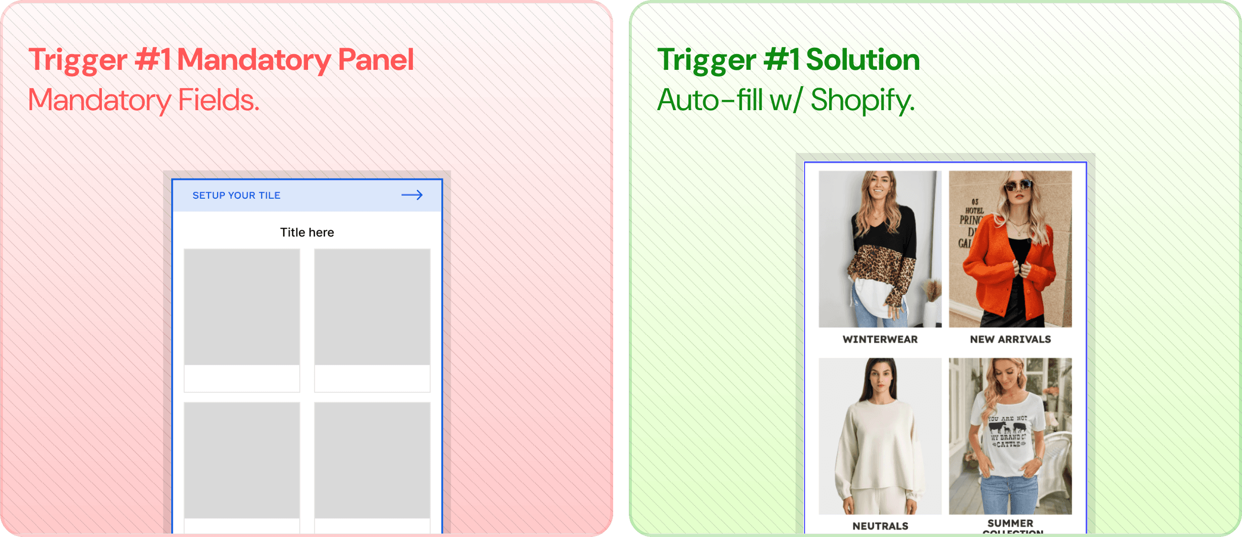
Mandatory Properties Panel Hijack.
Publish being blocked by mandatory properties.
Visual updates = better UX
Made the controls more compact.
Restructured the right panel for the tabs to have an expected behavior.
The editor-level controls were moved to a top bar.
Introduced a subtle nudge for users to select or drag & drop a tile.
Introducing the "Basics" Tab
We found that introducing new tab which would have everything that a merchant needs to complete a tile.
This meant layout came under the basics tab
Mandatory Properties would fit just right in after the layout.
Helping us lock out other tabs if we want users to finish the tile setup first.
This also helped us bring some layout controls like aspect ratio which were essential to tiles like bannners.

Need for the "Settings" Tab
Now that we, established the basics tab, we are left with the rest of the content tab items:
Toggles (Visibility of elements)
Text that people mostly don't change like "Add to cart" or "Buy now"

Changes in the "Style" Tab
Grouped controls by properties (e.g., Typography, Color, Borders).
Improved paywall messaging — upfront, expected, and contextual.
Reduced cognitive load with consistent patterns across tiles.

Changes to the Mandatory Properties ->
We took a two-pronged approach to solve the friction caused by mandatory fields; First, we improved visibility by grouping all required fields ensuring users saw what was needed right at the start. Then, we tackled the root cause—null triggers. By reworking 2–3 key controls to avoid null states altogether, we eliminated the very need for mandatory prompts.


Finally, After shipping all the changes ->
Live Rollout, Zero Breakage
This was a live product with 100+ tiles, so we couldn’t afford disruption. We planned a phased rollout—but in production, not in staging.
Outcomes

Support tickets pre-publish went down significantly.
Internal teams took ~1/2 the time to achieve same customizations.
Controls got more sleek & compact. Later used across the product.
